


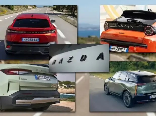
(Motorsport-Total.com/Motor1) – Classic trademarks on the radiator grille and tailgate are increasingly being replaced by spelled-out brand names in modern automotive design. These letters no longer serve merely as simple identification marks but are incorporated as fixed design elements directly into the body shapes and light signatures. Through the horizontal alignment of the typography, designers gain new scope for the visual balance of the entire rear of the vehicle.
Read more Formula 2 additional race in Baku raises doubts about Formula 1 finale
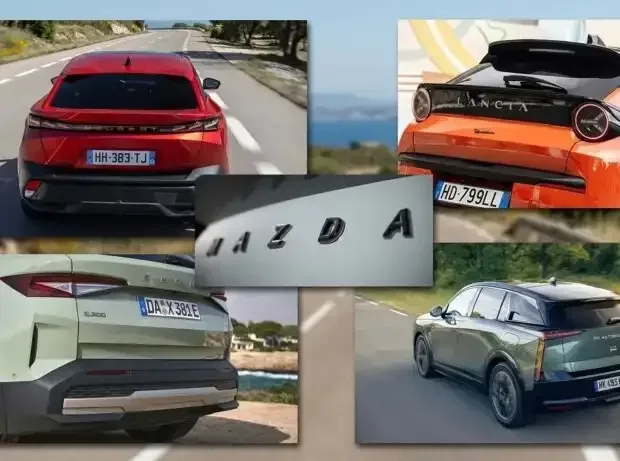
This is not a minor detail nor purely a graphic decision. Because the letters are increasingly fully integrated into the vehicle design and shape the design approach at the rear as well as classic and digital communication. Even at the front, the lettering is used more and more frequently. It is one of the most interesting developments in contemporary automotive design.
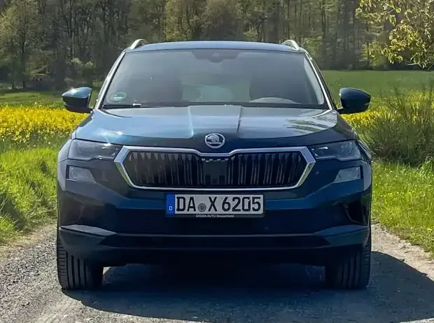
Why does Skoda no longer have a logo on the rear?
The Skoda Elroq shows this new trend particularly clearly. The lettering replaces the classic emblem both at the front and at the rear, thus becoming part of the Modern Solid design language that characterizes the brand’s new generation.
Not only the symbol changes, but also the way the car is perceived: The lettering takes up more space, follows the lines of the body, and becomes a graphic element that contributes to the balance of the entire design – similar to a light strip or a crease in the sheet metal.
Why do car manufacturers omit the logo? The real reasons from designers
In fact, the brand name written on the body is not a completely new idea: Porsche has been using it for decades on the rear band of the 911, while Volvo has often preferred the spelled-out name over the emblem. Today, however, this solution takes on a different meaning: It is no longer just a recognition mark but becomes an integral part of the vehicle design.
The brand name immediately conveys the identity of the car in every market but also opens up a new design tool for designers. A word claims horizontal space, interacts with the lights, follows a light strip, and shapes the rhythm of the rear much more strongly than a small central emblem.
Lancia or DS Automobiles interpret this principle in different ways. The typography changes, as do the proportions and even the spacing between the letters. However, the result is always similar: The brand is not simply applied to the body but becomes part of its composition.
If you wonder which car manufacturers have removed their logo from the rear, the following table provides a chronological overview of the most important European brands including the reasons for this design decision:
Read more Too little action in Madrid: Madring is to be changed for 2027
Which car brands replace their logo on the rear with lettering?
| Car Brand | Year of Change | First Models with Lettering Instead of Logo | Strategic Reason for the Change According to Manufacturer |
|---|---|---|---|
| Skoda | 2018 / 2019 | Skoda Scala, Skoda Kamiq | “Global readability & clean design: The lettering communicates the brand more clearly in global markets than the abstract arrow logo and appears purist on the tailgates.” |
| Lancia | 2023 / 2024 | Lancia Ypsilon (new edition) | “Italian fashion & history: The new lettering uses a handwriting-inspired typography. It embraces the new light signature and references classics like the Flaminia.” |
| Mazda | 2024 | Mazda EZ-6, EV concepts | “Kodo minimalism: The purist, smooth surfaces of the body should not be disturbed by applied plastic logos. Perfect integration into continuous LED strips.” |
| DS Automobiles | 2022 | DS 7 (facelift), DS 3 (facelift) | “‘Chrome detox’ & haute couture: According to chief designer Thierry Metroz, energy-intensive chrome is avoided. A matte lettering looks more elegant, similar to luxury fashion brands.” |
| Peugeot | 2022 / 2023 | Peugeot 408, Peugeot E-3008 | “Visual balance & aerodynamics: The front carries the dominant emblem, the rear remains clean. The lettering fills the width between the LED lights without disturbing aerodynamics.” |
| Lexus | 2021 / 2022 | Lexus NX (2nd gen.), Lexus RX | Premium presence: Departure from the oval L emblem in favor of a horizontal lettering that visually widens the rear and makes it appear calmer. |
| Dacia | 2022 | Entire range (Sandero, Duster) | “Robustness & rebranding: Part of the new brand identity. The rear is reduced to the essentials, emphasizing Dacia’s pragmatic, robust character.” |
Typography also becomes design
Graphics have always been an important element for a brand, especially in advertising and catalogs – sometimes also for a single model. Today, however, it is fully integrated into the design of the car or more generally into the brand image. Letters are designed with the same care as headlights, rims, or body surfaces and follow common design features.
Mazda and Peugeot provide two interesting examples. Mazda relies on a reduced, very clear lettering, while Peugeot integrates the brand name into the rear band and even illuminates it. Typography is thus no longer just a detail but part of the vehicle’s architecture.
More words, fewer symbols
It is hard to imagine logos disappearing completely: They remain one of the strongest elements of a brand’s identity and history and continue to play an important role even in the electric age. Nevertheless, the spelled-out name is gaining increasing importance, especially for vehicles of new generations.
This development describes well the phase in which automotive design currently finds itself: Surfaces become clearer, details are reduced, and every element must contribute to the model’s recognizability. Also against the background of a rapidly growing number of brands worldwide, especially in Asia.
In designs increasingly shaped by aerodynamics, safety, and sensors, a simple word can and probably must shape a car just as much as a headlight, a beltline, or a C-pillar.
More on the topic of design:
Interior design: How the Swedish living room moved into the car
Why do cars nowadays have split headlights?
Read more New time! This is why the DTM final in Hockenheim will start later than usual